
A website’s goal is to keep a user engaged. This means that a website must communicate its message clearly to a user, without causing confusion or distraction. At the end of the day, a website’s ability to engage and hold a user’s attention comes down to its typography—which basically refers to its choice and use of fonts. When a website contains good typography, users are able to easily read content, navigate the site’s pages, and understand the concepts put forward. Typography is a major component of successful web design, but it can be a difficult thing to get right. Factors like font size, coloring, background, and more can overwhelm designers and prevent them from creating a great website.
If you’re in Web Design Training, these typography tips will help you to optimize the typography of the website you create. The moment when you build these essential typography skills, you’ll be able to create websites that are both usable and engaging.
Don’t Go Overboard When Selecting a Font
Although selecting a typeface for a website can be exciting, as there are many to choose from, it’s important to remember the purpose of the typeface you’re selecting. A typeface should be easy to read, allowing users to focus on the content and not the font itself. Although there are many interesting fonts available for a website, readers will be distracted if a font is overly stylized and eye-catching. Select a font that is readable and professional over one that is unique.
Additionally, those in Web Design Courses should be sure to use no more than three different fonts within a website. If multiple fonts are used, they should complement one another subtly instead of drawing the reader’s attention to them.
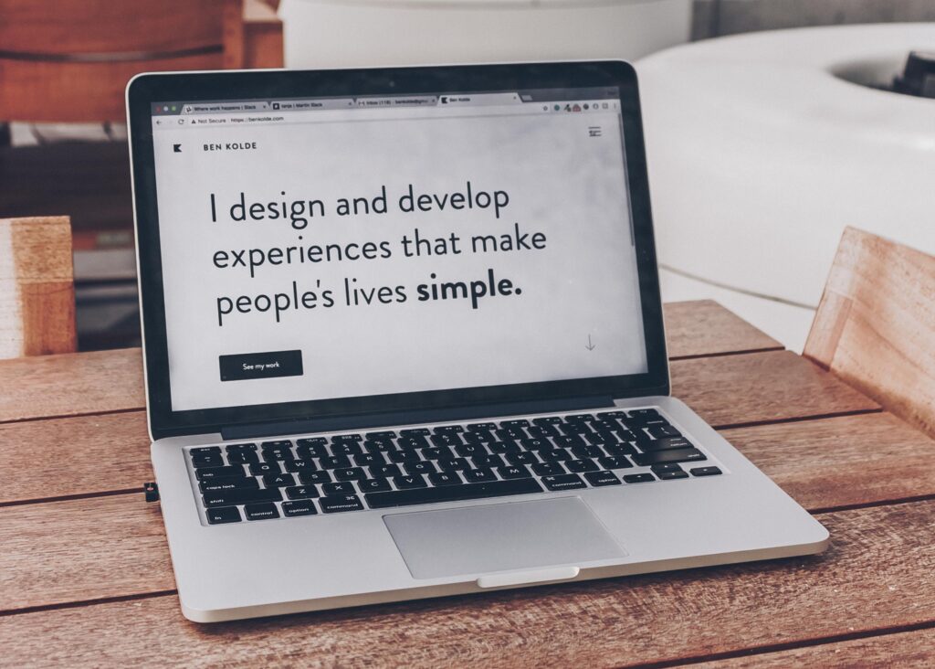
When designing a website, select a font that is easy for visitors to read
Use White Space to Your Advantage
An important aspect of readability lies in the amount of white space that exists on a website. Rather than overcrowding a page with content, make sure that users are able to focus on the text in front of them by arranging the typography in a way that utilizes white space. Spacing between paragraphs, letters, and headers ensures that a reader is not overwhelmed by the text, and improves their comprehension of the content. In order to make your website’s content readable, set the spacing between lines to 120-145% of the point size.
Choose a Scalable Typeface
When creating a website’s typography, it’s crucial to keep in mind that a website will be accessed from many different kinds of devices, viewed in different resolutions, and on a variety of screen sizes. In order to guarantee that readers will be able to view your website’s content, choose a typeface that is scalable. During your Web Design Training, practice scalability by playing around with different sizes of fonts to see how legible they are. If a typeface is hard to read when it’s small, it probably isn’t the best choice for a website.
Don’t Forget About Line Length
If you want to become a Web Designer, it’s important to know that the line length of the typography is another factor determining a website’s readability. When formatting a website’s typography, consider the number of characters appearing on each line. For mobile devices, there should be around 30-40 characters per line within blocks of content, while for desktops this number should be around 60-70. When designing a website, optimize the length of the lines of text by restricting the width of your text blocks. When the line lengths are uniform, readers will have an easier time focusing on and digesting the content.
Consider Contrast When Selecting Colors
In order to make a website’s typography stand out on the page, make sure that it is visible by choosing a color that contrasts with the background it’s set upon. The text will be more readable if it is easily distinguishable from the background. Thus, if a background is light in color, be sure to use dark fonts and vice versa.
Typography can be a tricky thing to get right, but it will make all the difference in creating a website that is readable.
Interested in a rewarding Web Design Career with AOLCC Winnipeg North?